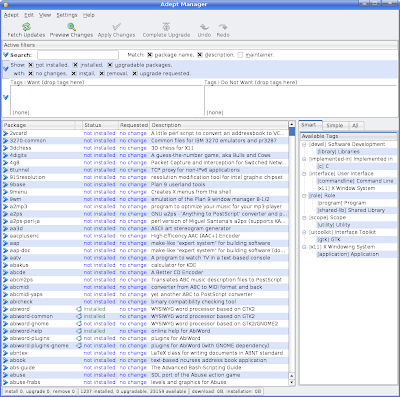
I wanted to get involved with an interesting existing FOSS project related to Kubuntu. Adept the deb package manager caught my eye. Now anyone who used the old 2.x version of adept_manager, will probably point out how the busy the user interface is. Its not the easiest tool to use. Then again you could pretty much say that about any KDE 3 programs (k3b and d3lphin) being the notable exceptions.
Adept Manager version 2.x
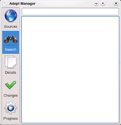
The newer version looks much cleaner and feels like a true KDE4 app. Very, very nice. Now while my C++ skills are not fantastic and my QT4 knowledge is non-existent, I would very much want to contribute to this app. I guess I will start off with filling bug reports, and slowly make my way into spelunking around the source code.
P.S. This post was written using KDE 3 & KDE 4 and Firefox 2.x & 3.0!


3 responses to “New Obsession: Adept 3.0”
Hello. This post is likeable, and your blog is very interesting, congratulations :-). I will add in my blogroll =). If possible gives a last there on my blog, it is about the DVD e CD, I hope you enjoy. The address is http://dvd-e-cd.blogspot.com. A hug.
Adept 3.0 was in need of work but this upgrade leaves much to be desired.
I’m not convinced that the side strip of icons is intuitive for most users in this case, or necessary in this form (its not like Adept is like Kontact, ie. a container for many applications). My thinking is that simple icons under the menu’s in a more ‘traditional’ style would be fine – or at least provide a grab bar so the user can drag and drop the icons where the user likes.
The readily visible search box is of course a must.
But the sections “Relevant Tags” which looks like a title heading for what is below it rather than above, this being the “Interface / Role / Use” section with its horrible appearance, odd structure of links and its cryptic [not] exclude/include links (I’m still not entirely sure) is an excellent example in how NOT to design an interface.
It seems unfinished to me, and if this is the case, Adept wasn’t in a fit state to be included in Kubuntu 8.10. Its simply not usable for grandma.
You need to remember what kind of user a graphical package manager is aimed at and take another look at creating a front end for APT that is more beautiful, simpler, and more fun than Synaptic. I think that should be the goal No. 1 here.
I agree with you Jeremy about the need to make Adept more user friendly. The new version is far from something ideal or obvious to use. But the older releases were far worse.
Having worked with the new version, I find searching the repository much faster. The current filter system is not trivial. Figuring out which filters I turn on is confusing too. And the workflow of some simple tasks, like upgrading feels stramge compared to other package managers.
When I wrote this blog entry, I really hoped that I could help improve the user interface and workflows. Unfortunately, getting involved with the project also proved non-trivial. After I realized how difficult it was to simply BUILD Adept from source, I basically gave up. I’m guessing I need more experience with working with Qt and C…
But someone should really look at making Adpet more fun and easy to use.